|
On April 3rd 2019 I, with my assistant Michael, gave a presentation on the topic of Designing with Communities. This seminar gave a brief overview of what communities are, what issues communities face, and methods for designing with communities. The presentation can be seen below:
Following the seminar, I led a Participatory Design workshop with the class, where we would explore the topic of pollution in the UL campus community.
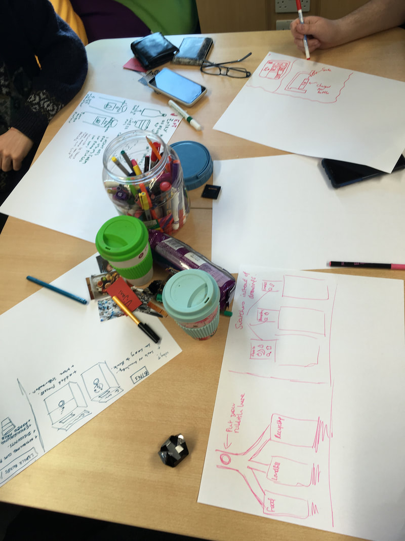
We started our workshop with an 'ice-breaker' using 'show and tell' as a warm up method for getting the groups to think about a particular topic before attending the workshop. In an email prior to our seminar we asked the participants to bring "one item that represents pollution (in any form) on campus; something that you see as a cause of pollution, or something that you think is contributing to reducing pollution, or anything in between. Just make sure it's something representing what YOU think is an issue!" So, when our workshop began we asked our participants to take out the items they had brought with them and we discussed them and why we felt they were important issues to address. There was one cause of pollution that the entire group found themselves concerned about: plastic. Three of the participants brought something that was exclusively a form of plastic (plastic bag, plastic packaging etc.), and others brought items or images that alluded to the disposal and waste of plastic, particularly single use plastics. Traffic and public transport options in Limerick were also spoken about by the group. Following the ice-breaker, I posed two questions to our participants; "How can the UL community reduce their pollution on campus?" and "Where are the most polluted places on campus?". I provided a map of the UL campus for the participants to understand the extent of the area we wanted to talk about. Again, the issue of traffic leaving UL in the evenings was mentioned as it is spectacularly inefficient. This traffic added to both air and noise pollution on campus. The river was also mentioned, not so much as a source of pollution, but as an entity affected by pollution. The river and its banks are popular walking areas on campus, and the tide often washes rubbish onto the banks. There is plenty of wildlife in the area that is dependent on the river, so this consistent level of pollution was worrying to the group. After posing these questions to the group and discussing the aforementioned issues, I handed out a set of picture cards to each participant. The pictures on the cards depicted various types of pollution and dangers associated with it. We asked the participants to choose three or more pictures that they felt represented the biggest challenges on campus. The top choice, which we could have predicted based on the discussions to this point, was the image of the plastic waste. The traffic image was also selected by the vast majority of participants. Rounding out the top three issues faced by the campus community was food waste. 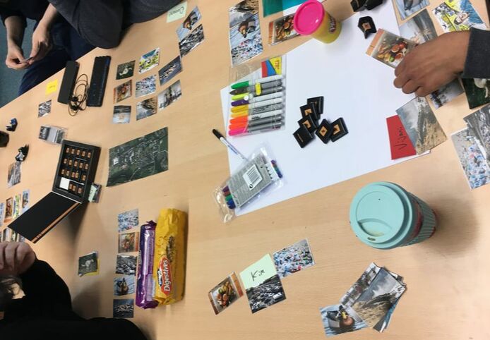
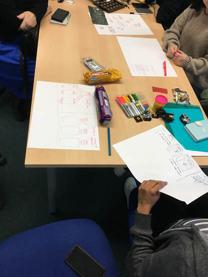
At this point, I decided to split the group into two based on the issues they identified through pictures as concerning, as well as their show and tell items. The two groups were asked to discuss these topics briefly again before choosing one issue to to think about in depth and develop potential solutions for. Ultimately, both groups chose single use plastic and plastic waste. The groups developed brainstorms and sketches of their ideas for approximately 15-20 minutes.
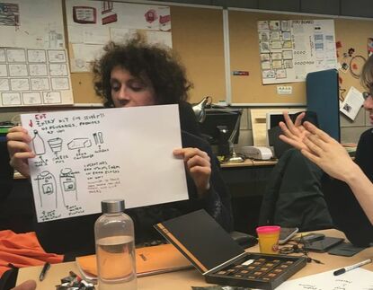
Overall, I think my workshop ran quite smoothly. All participants seemed to enjoy the workshop and participated at each stage. The final water fountain concept was a synthesis of everybody's ideas, which as Muller's 1991 paper stated (see slides), is indicative of successful participatory design.
If I were to run it again, instead of considering the participants solely as part of the UL community, I might branch out and consider them part of the Limerick community as to get a wider range of ideas facing the city. I would also use a more durable/sticky material for the final activity, as the play-dough did not stay together in the way that we hoped it would!
0 Comments
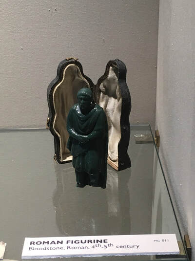
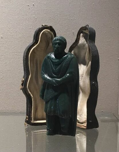
For my seminar on Cultural Heritage, I brought the cohort to The Hunt Museum in Limerick City, to explore this topic in context. We were first given a presentation to help us understand the topic of Cultural Heritage, and this was followed by a tour of The Hunt Museum with a docent. The museum houses the private collection of John and Gertrude Hunt. I'll let The Hunt do that for themselves: (*click on the picture below to go to The Hunt's website!*) 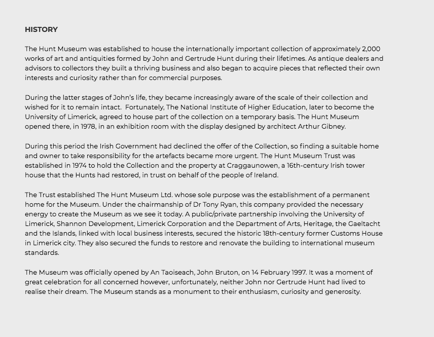 We were taken on a tour by our docent, with the cohort consider my instruction to think about how a piece in the exhibition could be made more interactive. They could choose either our favourite piece, or a piece that could lend itself to an interesting display of interactivity. I decided that it would be pedagogic practice for me to participate fully, included demonstrating the thinking behind my design decisions, so I selected a Roman figure. In the Roman section of the exhibition stood a small, jade-coloured figurine with a case seen below. The figurine was a Roman man with his hands clasped in front of him, wearing a barbarian robe and a band on his head. Although the museum says that it is difficult to date this piece, they have placed it between the 4th and 5th centuries, with its accompanying case dated to the 17th century.
Although the tour with the docent was informative and enjoyable, not everybody wants to attend a guided tour. Also, some of the pieces being spoken about may not be of interest to the individuals on a standard tour, and a visitor may want to know more about the pieces not spoken about. Each docent has their own style, likes and dislikes, therefore each tour may be different depending on your guide. For example, our docent did not speak much about the Roman and Egyptian sections, but these were the sections of most interest to me. However he did speak for an extended period about the sections that depicted Christianity, Jesus, and the Saints, which may not resonate with or interest someone of little to no religiosity. As there was little information given orally and visually regarding certain artefacts, it can be difficult for some visitors to get an appreciation of the various aspects of collection. All of this is to say that a standard guided tour may not suit some museum visitors. This is where my idea comes in.
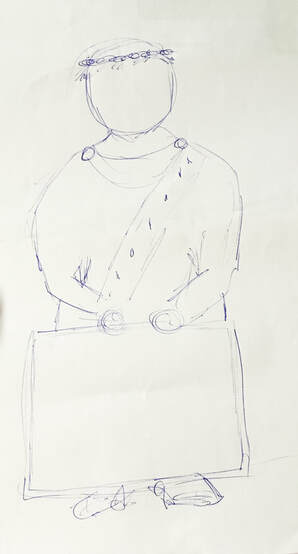
I developed a storyboard to articulate how I envisioned The Roman Guide would operate in the museum. The storyboard depicts a history student, Amy, touring the museum. As she comes to the Roman section of the museum she sees a new interactive feature; The Roman Guide. Amy is interested in the artefacts present in the Roman section, so decides to use The Roman Guide to learn more about these artefacts. When she first picks up The Roman Guide she puts sees the screen saying 'I am The Roman Guide'. She follows the instructions on screen, which tell her to put on headphones if she would like to hear the stories of the artefacts. The Roman Guide then introduces himself as Avitus, a Roman senator from the 5th century, and tells her that she will hear about the artefacts from his perspective by pointing his head to the NFC tags of the artefacts she wishes to learn about. She points Avitus' head to the first artefact, and the screen Avitus is holding begins to play a short video, with Avitus narrating. Amy continues to explore the artefacts in the Roman section using Avitus as her guide. Once she is finished in this section she returns Avitus to the museum so that he can guide the next visitor through his time. 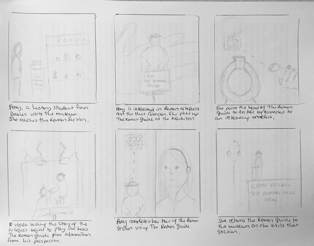 The Roman section of the museum is next to both the Egyptian and Greek sections. I thought therefore that instead of The Roman Guide being the sole interactive guide for the entirety of the museum, the Eye of Horus Amulet, or indeed the Figure of Horus could explore the Egyptian section and the statue of a male figure could explore the Greek section using the same method as The Roman Guide, as I think this would give a more authentic experience of each era.
For the workshop activity in CS6022, students were tasked with creating a prototype wearable. I participated with the group to provide guidance as to best practice, while letting them lead the process (as such). The domain of exploration was open. The group focussed on reminder mechanisms and tools. This was the starting point of exploration as the group felt that reminders were something we all had issues with. Some of the reasons for this issue included:
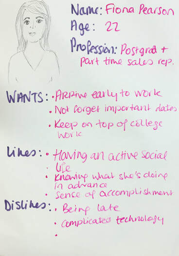
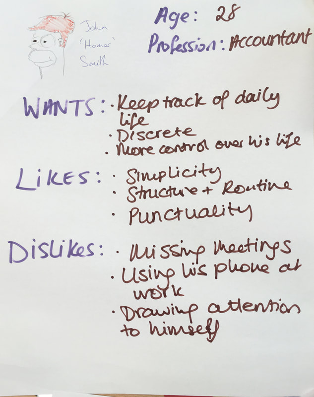
After a minor brainstorming session, in which we concluded that a wearable technology that could be used discreetly could function as an additional layer of notification. From this point, we created personas. The personas are representative of two distinct user types, a student with a part time job, and a professional. These were chosen because both have responsibilities to keep on top, of with limited access to their mobile phones at certain times. The personas are shown below:
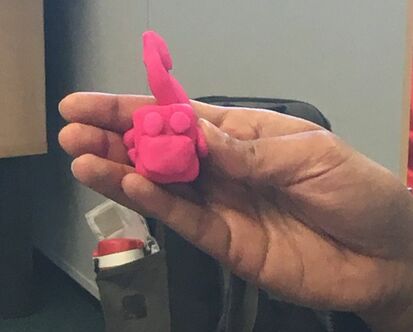
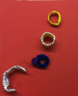
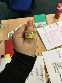
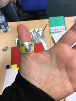
As you can see, the personas differed in most aspects; profession, gender, likes and dislikes. However, there were some overlapping needs, which we defined following a quick bodystorming session: 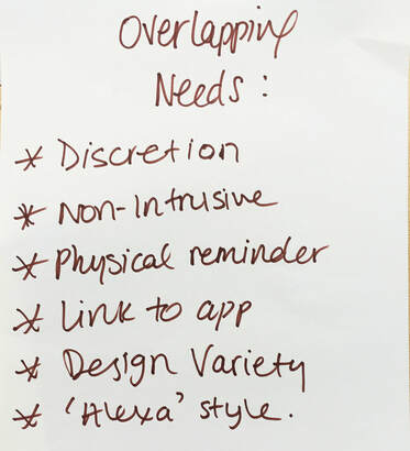 These needs, defined as each of us took on the role of a persona in the bodystorming session, led us to the concept of a piece of jewelry, namely a ring. The ring was to be available in a variety of designs for men and women, with haptic feedback to signal a notification, for example pulses or vibrations. We thought that numerous feedback options should be explored to satisfy the 'design variety' need noted above, and therefore we would include an auditory reminder and a visual signal such as a light or text in different iterations. Each member of the group decided to create their own prototype with the materials available to us, which included paper, tinfoil, pipe cleaners, play-doh and pom poms. The prototype I created can be seen in detail below; it includes a 'screen' which displays a written reminder, a microphone across the top section of the ring (the tinfoil), and a button on the back which the user would hold to activate the microphone. It was created using paper, sellotape, tinfoil and play-doh.
Overall, our short exploration of prototyping wearable technology was informative and interesting. We found that satisfying the needs of various users was no easy task, but despite the simplicity of our prototypes, we felt that our exploration and end product was successful.
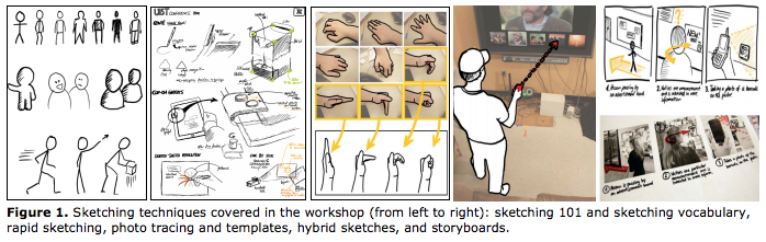
Title: Sketching as a Design Technique Aims: Sketching is a technique that affords a researcher the ability to create, describe and refine ideas. Outline: Sketching can be undertaken using a variety of media, from pencils and pens to drawing tablets. It is a method used by people of many professions; artists, designers, architects, mathematicians, researchers. Although it is often perceived as an artistic endeavour, in this application (design practice) it is a way of exploring ideas, of idea generation and is a method that can be used by anybody for any designerly purpose, regardless of artistic ability. Sketching allows a person to brainstorm, as such, through a visualisation of ideas in a non-verbal way. It is a key "ideation" technique, i.e. creating multiple variations of any one idea. Example 1: "Sketching User Experiences" by Bill Buxton (2007) This book is a designer's go-to book on 'getting the design right and the right design'. Buxton analyses the design process and focusses on the importance of using sketching as a mechanism for creativity, as an origin point, regardless of the eventual application, e.g. interaction design/product design. He also makes the point that the process of sketching can be viewed as a conversation or journey, and that it is the uncertainty of our drawings that can lead us to our desired destination. "This prompts us to view sketching as relating far more to an activity or process (the conversation), rather than a physical object or artifact (the sketch). Certainly the physical sketch is critical to the process, but it is the vehicle, not the destination, and ironically, it is the ambiguity in the drawing that is the key mechanism that helps us find our way" (Buxton 2007, p117). Example 2: "Sketching User Experiences: The Workbook" by Bill Buxton, Saul Greenberg, Sheelagh Carpendale and Nicolai Marquardt (2012) This is the workbook which accompanies Buxton's book "Sketching User Experiences" (2007). The workbook allows readers to more fully understand a variety of sketching and design methods explored in its accompanying textbook. It details how sketching can be practiced, but more especially why it should be done in the first place. It also gives visual examples, for example the 10 plus 10 method, which develops 10 different ideas and then refines the selected ideas. The steps in this method are:
The workbook demonstrates this method with the challenge from point 1 being "connecting two smartphones". 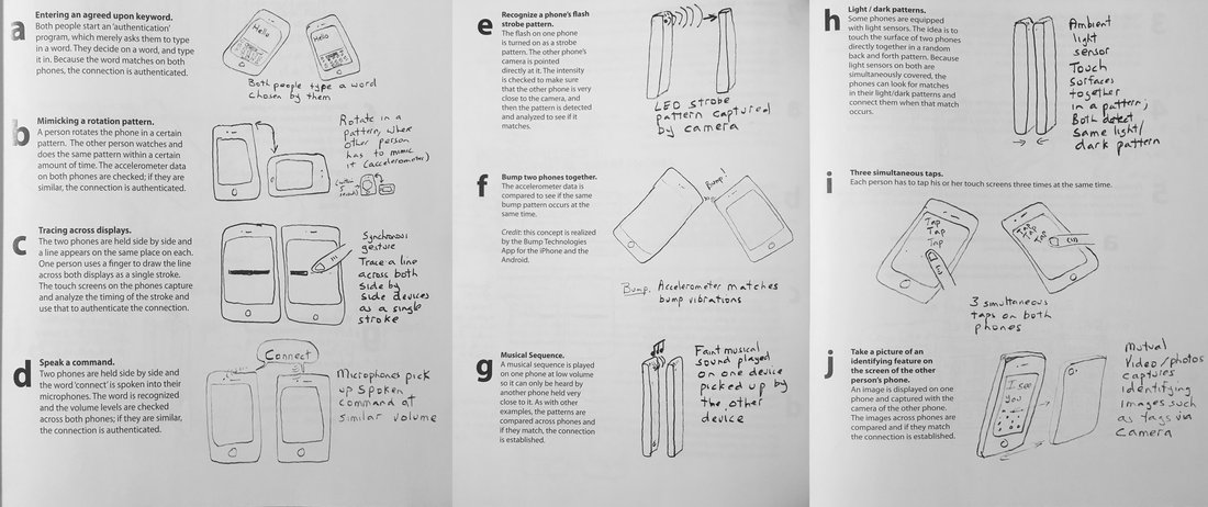 Example 3: "Sketching User Experiences: Hands-on Course of Sketching Techniques for HCI Research" by Nicolai Marquardt Marquardt has written a paper based on some of the sketching methods explored in the Sketching User Experiences Workbook. The paper states that they intend on undertaking a number of design sessions in which they wish to teach the workshop group a variety of sketching methods for use in an Human-Computer Interaction setting. These methods include;
 Example 4: The evolution of the character and visual representation of Darth Vader, from "The Secret History of Star Wars" by Michael Kaminski Kaminski wrote about the 'secret history' of the Star Wars franchise, which included some discussion on the development, both conceptually and artistically, of one of the series' most memorable and popular characters; Darth Vader. In the first draft of the script, Vader was an inconsequential character, but for the second draft his character was combined with that of a Sith Lord Prince Valorum, giving us the Vader we know today. Initial artwork for this character was by Ralph McQuarrie, who says that the addition of a mask to a human body was because "in the script there was a description of Vader crossing between two ships in space so I created this mask so he could breathe in space", which George Lucas loved, and therefore it remained. So, the initial sketches (seen below) informed the direction the character took from the second draft of the script. 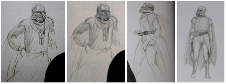 "It appears that McQuarrie began such sketches while Lucas was in the midst of writing the second draft, because the character is described in that script as wearing the respirator mask that McQuarrie first sketched here. Following this, McQuarrie made a number of alterations at Lucas' request. The robes became more exaggerated, and the character was requested to have a wide-brimmed samurai helmet, which McQuarrie combined with his respirator to create a fearsome face-mask which completely obscured the character's face" writes Kaminski. This is the second round of character sketches with these requested changes: 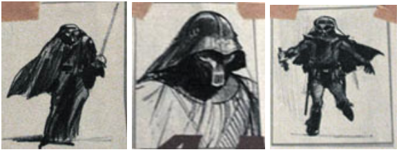 Inspiration for Vader's look also came from a scene in Lawrence of Arabia, where a man dressed in black robes shoots Lawrence's guide from a distance, then approaches and dismounts his camel. His headdress covers his face. McQuarrie thought that "'Vader would look more menacing if he was robed and armored', and so his next sketches reflected this design. Lucas also provided McQuarrie with comic books and 1930s pulp fiction material to help steer the visual design." 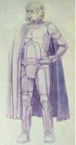 Following this new, more militarised and armoured look to vader, McQuarrie made changes to the mask to give it a more elongated face grill, and exaggerated eyes. This updated mask also shows inspiration from the comic books and artwork provided to McQuarrie by Lucas. McQuarrie then created his final artwork for Vader; a full colour painting of Darth Vader taking on Deak Starkiller in a lightsaber battle, which can be seen below. 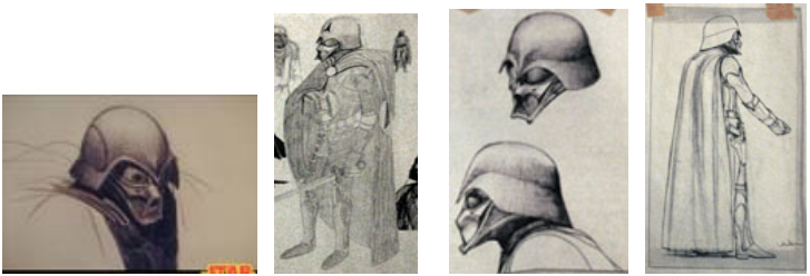 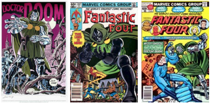 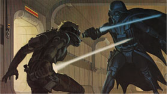 According to Kaminski "In draft two the character of Darth Vader only had two scenes--the opening described above and then the final space battle where he is killed--but since McQuarrie had designed such an impressive villain, Lucas expanded the character with much more screentime for the third draft. The mask, of course, was not a permanent fixture, since it was merely a respirator for the opening sequence--in one scene, Vader is explicitly shown to have removed it, and drinks casually from a flask. The frightening helmet would only be seen in the opening sequence, and likely at the final space-battle sequence when Vader pilots a craft; for the rest of the film, on the Death Star, the character would simply be portrayed by the face of whatever actor was cast in his role. However, in the fourth draft, Lucas decided that the character would be more effective if he wore the space suit throughout the length of the film." The one other characteristic of Vader that has not been addressed yet was the voice, or sounds that he would make. This was between Lucas and the sound designer, Ben Burtt. The mechanical breathing was dictated somewhat by what would suit the respirator mask, designed by McQuarrie. All of this is to say that the initial sketches informed the entire character of Vader, from his samurai-like mask to his mechanical voice. Going back to Buxton's (2007) analogy of sketching being the journey to the desired destination, the prototype (or in this case, the final images) are the destination, whereas the sketches leading to this point has been the journey that both McQuarrie and Lucas took to explore and create the character of Darth Vader. Comments: Sketching is an incredibly effective method for conveying ideas to others, but also as a means of having a reflexive conversation with yourself. Ideas can change with each sketch; they can become clearer, include new elements, refine the form an idea can take. A sketch does not have to be a piece of art. A quick, rough sketch can realise the concept from your mind and can convey the envisioned concept to others. Sketches of multiple iterations and fidelities can also be of great use to aid with and map the the evolution of an idea. Following the advice of Buxton (2007), you must first find the right design, and then get the design right; which implies an iterative process. If unrestrained sketching does not suit somebody, they can undertake a variety of sketching methods as outlined by Buxton (2007) and others, which should give more rigidity and structure to someone less inclined to ideate freely.
Application: Sketching can be used in a wide variety of domains, but is generally used in all design situations. Sketching can be seen as the very first example of a design. The designer may have an idea in their head, but sketching it on paper will allow the idea to take a physical form. Continued sketching, or iterative sketching, can allow for the evolution of an idea or concept, until its physical form resembles the most desirable outcome. Often a designer will set themselves a challenge using Buxton's 10 plus 10 method (2007), to create iterations of the same idea, and then refine the most promising sketches until they have achieved their goal. Learning: Sketching is a technique that everybody, of all artistic capabilities, can use. Sketching can be done using something as simple as a pencil and paper, or as complex as a drawing tablet with appropriate software. Different fidelities of sketching are possible, from low-fidelity stick figures to high fidelity digital visualisations, so sketching is not off-limits to anybody. It is, however, a worthwhile skill to invest time in for any designer. A persons sketching ability can improve over time, so practicing and challenging oneself to create more sketches and become more detail-oriented can improve this skill set. Using different media, for example markers or colouring pencils, can also help a designer to improve their sketches, as the addition of colour can change the way a sketch is viewed. Time and cost: There can be very little cost related to this activity. As I have mentioned before, it can be undertaken with something as cost effective and readily available as a pencil and scrap piece of paper. Of course, if you wanted to create digital sketches using a drawing tablet and software, the price can increase dramatically. However, this is not the only consideration. Using a pencil and paper means you are not constrained by the affordances of design software, which could negatively impact on the free flow of ideas, of ideation. The time related to this activity can also vary wildly depending on the desired outcomes. References: Buxton, B. (2007) Sketching User Experiences: getting the design right and the right design, San Francisco: Elsevier Greenberg, S., Carpendale, S., Marquardt, N. and Buxton, B. (2012) Sketching User Experiences: The Workbook, Waltham, MA: Elsevier Kaminski, M. (2007) The Visual Development of Darth Vader, The Secret History of Star Wars, available: http://fd.noneinc.com/secrethistoryofstarwarscom/secrethistoryofstarwars.com/visualdevelopmentofdarthvader.html [accessed 01 Feb 2019] Marquardt, N. (2017) 'Sketching User Experiences: Hands-on Course of Sketching Techniques for HCI Research', CHI EA '17 Proceedings of the 2017 CHI Conference Extended Abstracts on Human Factors in Computing Systems, Denver, Colorado, USA, 6 - 11 May, New York: ACM, 1261-1263, available: 10.1145/3027063.3027107 [accessed 01 Feb 2019] All images in Example 4 are copyright Lucasfilm. They are used under the rights of fair use/fair dealing for educational purposes in Ireland. |
Author: Kim O'SheaThis page will be used to post my assignments from taught modules in UL over the course of my master's prgram. Head over to my portfolio page for a look at some of the work I have done in my undergraduate program of Digital Media Design! Archives
April 2019
Categories |
 RSS Feed
